Tenant Configuration
The privacy portal/ tenant screen is where the customers and employees can place privacy requests. A tenant can be configured in different ways using various customizations like Act, request types, requestors, and more, through the DSAR Configuration option, for placing different requests.
Some parts of the portal can be differentiated based on the requestor types, requests, and more. These customizations are also possible through the tenant configuration screen.
Roles & Permissions
Creating, modifying, and viewing a tenant or configuring the privacy portal would need either the Administrator or Data Steward permission.
Administrator -- has all the permissions. (All Modules)
Data Steward -- have only (View & Edit) permissions. They don't have the permissions to Export, Delete or create.
Creating a Tenant
A new tenant can be created and configured from scratch, or an existing tenant can be updated to meet the requirements, using the Tenant Configuration option.
For creating a new tenant,
- Log in to the Data Governance Tool.
Once logged in, the Data Governance Tool displays the Main Screen.
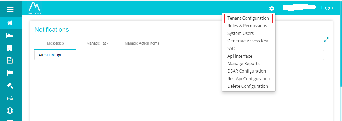
- Click on the 'Settings' icon on the top right corner of the Main Screen.
 ../Products
A drop-down menu is displayed by clicking the 'Settings' icon.
../Products
A drop-down menu is displayed by clicking the 'Settings' icon.
- Select the 'Tenant Configuration' option from the drop-down menu.
This selection displays the Tenant Configuration screen, where you can update the existing tenant or create a new one.
Note: Admins have the right to view and configure every tenant. Others would require additional permissions for it.
For configuring a new tenant,
- Click on 'New'.
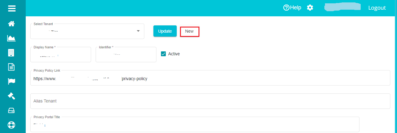
Type in the 'Display Name' and 'Identifier' on the Tenant Configuration screen.
Mark the tenant active by checking the 'Active' box.
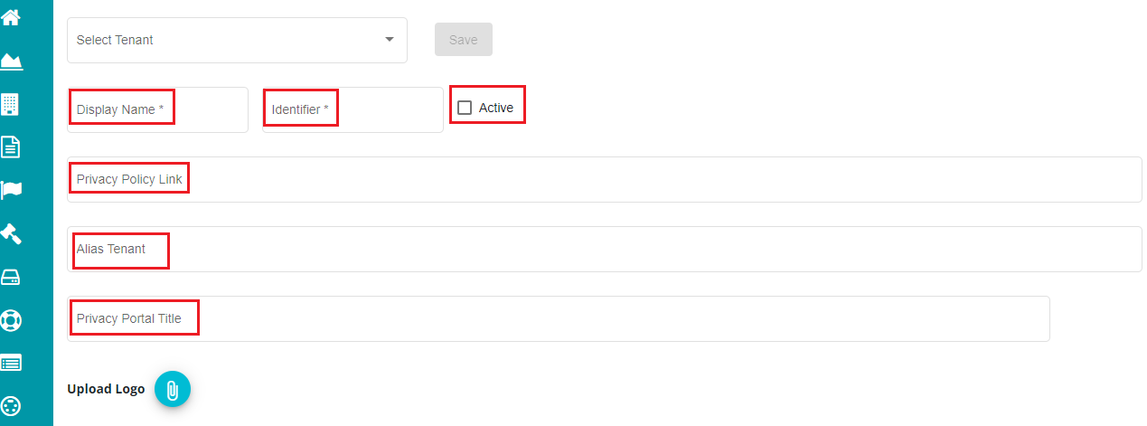
Display Name -- the name used for display purposes, through which you can identify the tenant. Display name can be defined however you like, irrespective of the letters' case. You can also use special characters if needed.
Identifier -- this is used to identify the tenant in the backend. An identifier cannot be in capital letters and cannot be a duplicate (shouldn't be matching with any other tenant's identifier). Also, you cannot use special characters, symbols, etc.
Note: Display Name and Identifier cannot be left blank when configuring a tenant.
Enter the 'Privacy Policy Link' in the dialog box.
Type in the title for the privacy portal in the 'Privacy Portal Title' dialog box.
Alias -- a tenant can have multiple tenants linked to it, commonly known as Alias Tenants. Aliased tenants will not have any data mapped to them. You can add an alias to the current tenant in the 'Alias Tenant' dialog box.
Note: once a tenant is made an alias to another tenant, it cannot be reversed.
Privacy Portal Link and Privacy Portal Title are not mandatory. If they are left blank or aren't configured, you wouldn't see any title on the welcome page.
- Click on
 button.
Once the Tenant is created, a blank screen is displayed with a welcome text. You can now configure the logo, region, and request types in different ways at requirement. The configurations are subject to different regions and validations.
Note: The Welcome Page is where the customers can place their requests to the company.
The tenant configuration provides the following changes:
Logo
Privacy policy links
Privacy Title Configuration
Privacy Portal Links
Themes
Privacy Portal Title
- Upload Logo
For uploading a logo to be displayed on the tenant welcome screen,
Go to the Tenant Configuration Screen.
Click on
 next to the Upload Logo.
The screen displays the files present on your device. You can select the logo for your tenant screen from here.
Click 'Open' after selecting the logo.
Click 'Update' button after making these changes.
You can see the logo being displayed on the top-left corner of the Tenant's Welcome Screen.
Supported formats -- svg, jpeg, jpg, and png.
Size -- image file size should be less than 1mb.
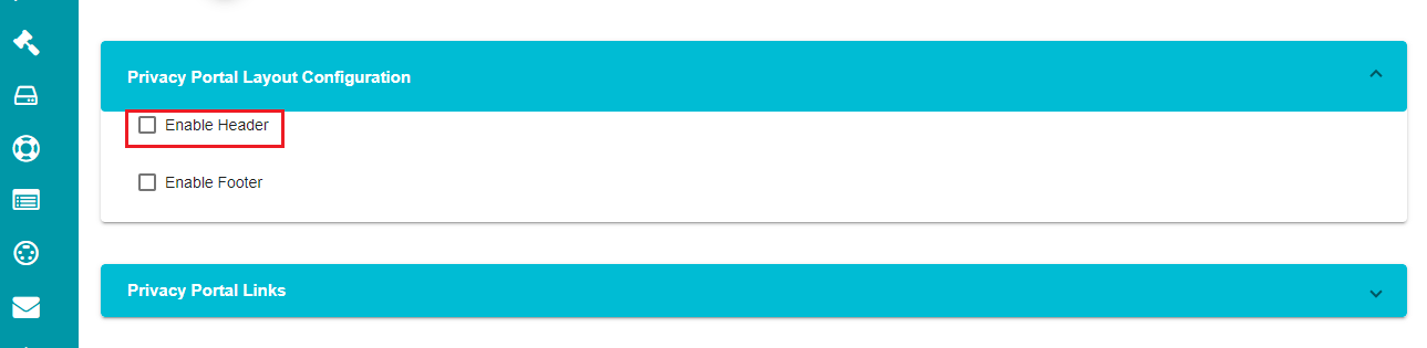
- Privacy Portal Layout Configuration
The header and footer for the welcome screen can be configured under this setting. You can change the logo position and background color for the header. Likewise, you can add text to the footer, change its background color and modify the footer's alignment.
- Click on
 against the 'Privacy PortalLayout Configuration' tab.
You can see two options on the screen -- Enable Header and Enable Footer.
- Check the 'Enable Header\' option on the screen.
- Click on against the 'Page Header
Configuration' tab.
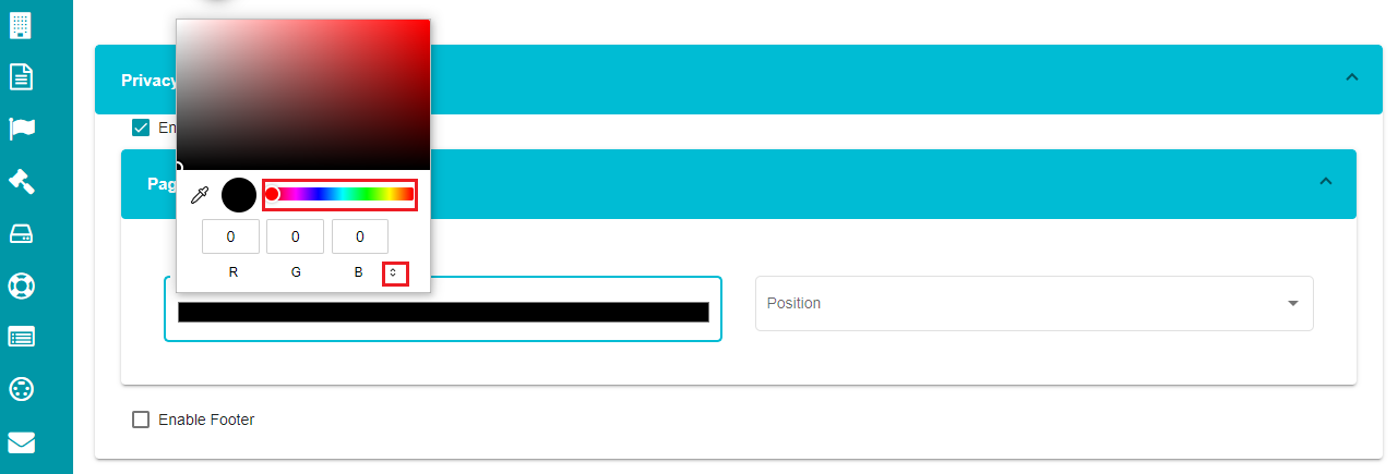
Click on the 'Background' option. You can see a color palette appearing on the screen to choose the required background color.
Choose the required color from the palette.
Note: there is an arrow to change the color format among RGB, HSL, and HEX.
- Open the position drop-down menu and choose the required position for the header.
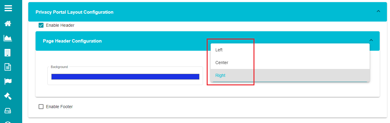
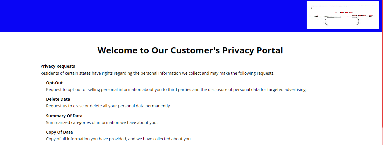
Based on the chosen color (blue) and position (right), the header on the welcome screen would look like this:
Note: uncheck the enable header option if you don't want to customize it.
- Check the 'Enable Footer' option on the screen.

- Click on against the 'Footer
Configuration' tab.
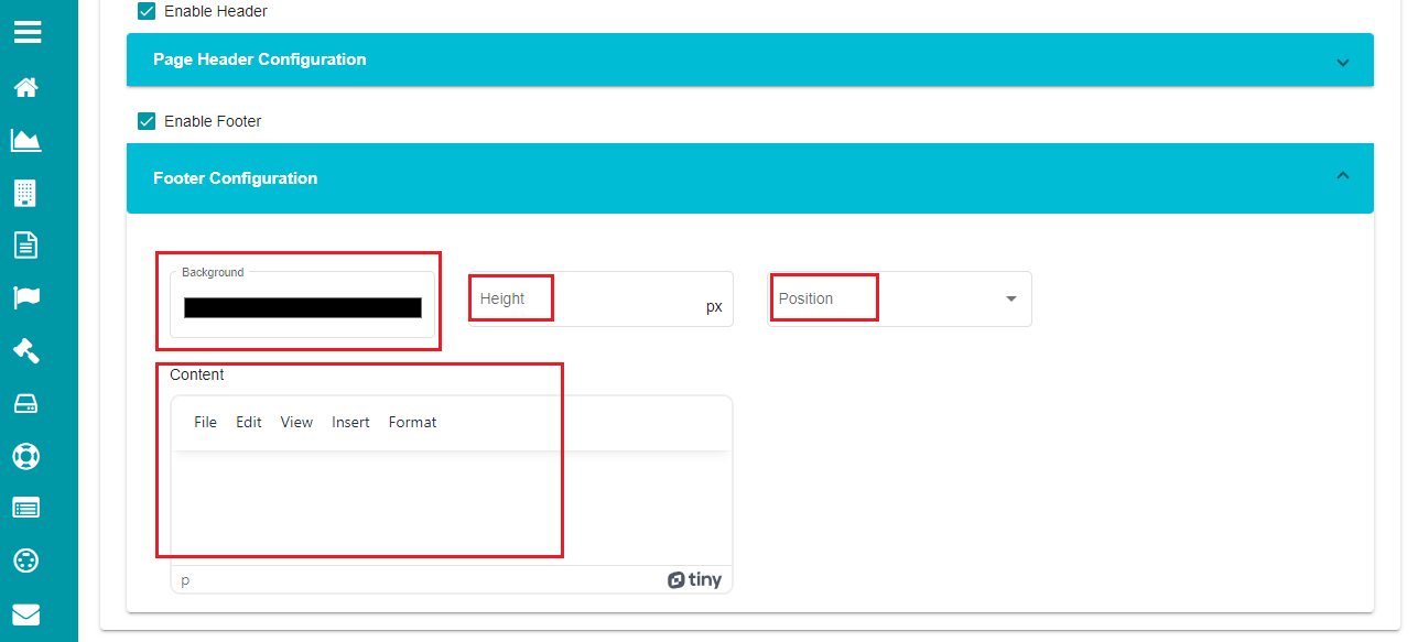
Note: you can define the background and position for the footer just like in the header.
Use the 'Height' option if you want the footer to appear at a specific height.
Add the text in the content field if you want any text to be displayed on the footer.
Note: Content tab provides different options to customize the text at requirement.
File -- to insert a new document or print.
Edit -- to cut, copy, paste, select, and more.
View -- to view visual aids.
Insert -- to hyperlink or add a horizontal line to the text.
Format -- to make the text bold, in italic, and format it through different options like background, alignment, etc.
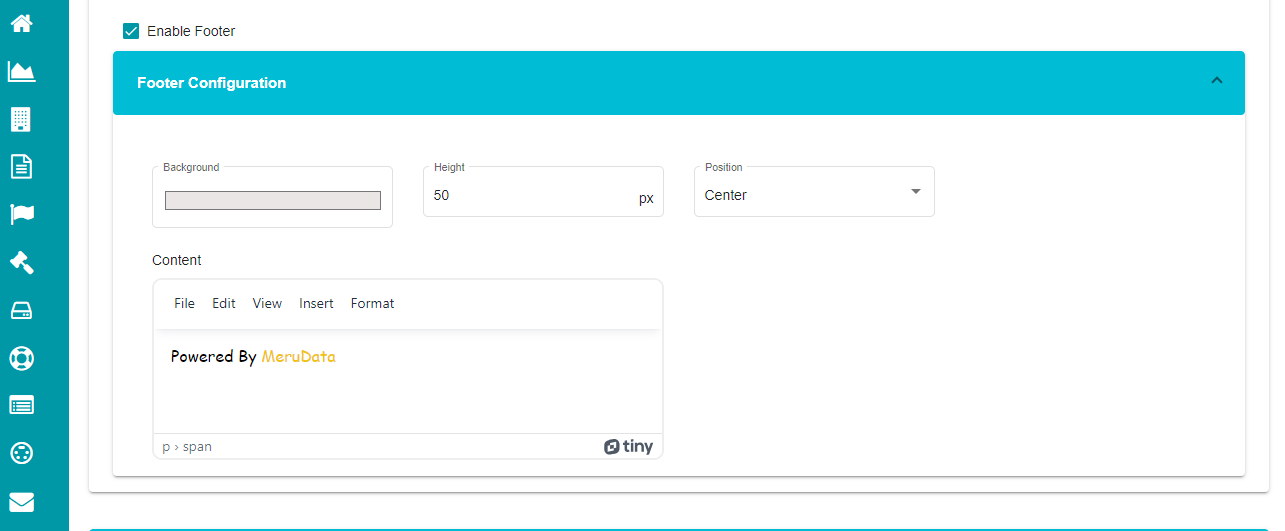
Based on the selection, the footer appears in the following way on the welcome screen.
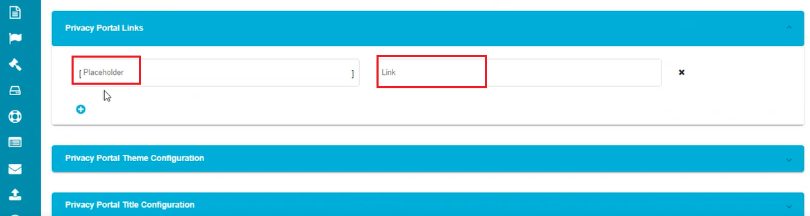
- Privacy Portal Links Configuration
This configuration is used to display hyperlinks of privacy policies related to different requestor types. For example, if the customer is accessing the tenant welcome screen, they can use these configured hyperlinks to check the privacy policies related to other requestor types (say employee). This option allows the configuration of multiple hyperlinks in a single request form with the same display name.
Note: In general, the Privacy portal links are configured below the Display Name and Identifier. This configuration is useful if you want to differentiate the links for different requestors or different forms.
Click on
against the 'Privacy Portal
Links' tab.Click on
 to define new variables for the
portal links.
to define new variables for the
portal links.
The screen displays two options to configure privacy portal links for different requestor types within the same request form.
- Define a name/placeholder in the 'Placeholder' dialog box.
Note: Placeholders don't have a specific format for being defined, but they should be defined within '[]' braces for them to be considered as placeholders for the specified links.
- Enter the required URL in the 'Link' dialog box.
- Click on
 to save the changes.
The name defined under the placeholder dialog box now becomes the variable for the defined URL, and the hyperlink appears whenever the variable is used in a request form's description. Multiple variables can be configured using this option.
Note: In case of not defining any variables under the privacy portal links and a variable is defined in the request form's description in the Form Configuration screen, the defined variable takes the default link given by the user when creating the tenant.
- Privacy Portal Theme Configuration
This configuration can be used for the tenant's Welcome Page and privacy form, and customize the theme, font styles, backgrounds, etc., of the welcome screen and privacy request form for a particular tenant.
Note: In general, the Privacy portal links are configured below the Display Name and Identifier. This configuration is useful if you want to differentiate the links for different requestors or different forms.
For Welcome Screen,
- Click on against the 'Privacy Portal Theme
Configuration' tab.
The screen displays two options here for configuring the Welcome Screen and Privacy form separately.
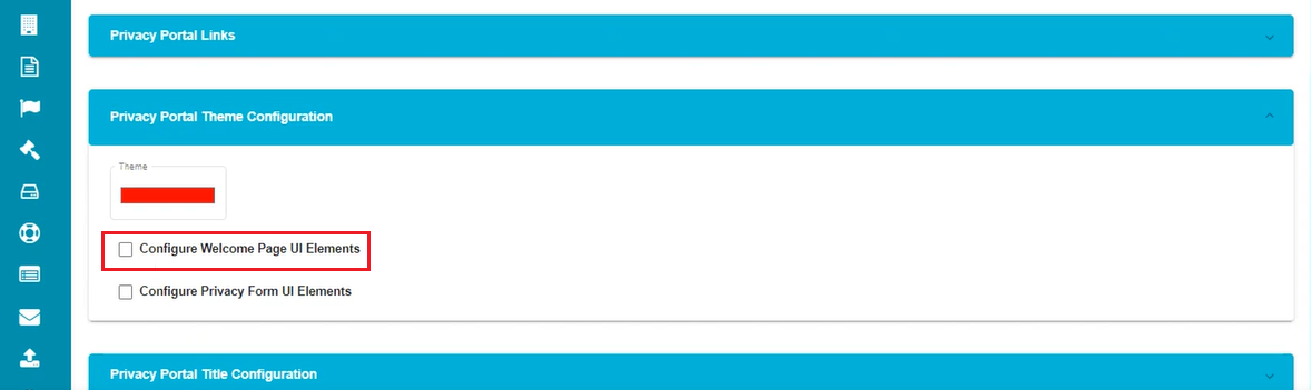
- Check the 'Configure Welcome Page UI Elements' box.
The screen displays a drop-down form for configuring the welcome screen UI elements.
- Click on against the 'Welcome Page
Configuration' tab.
Here, the screen shows different options like font, background color, title, etc. These changes are reflected on the tenant's welcome screen. You can configure each of these options and decide how your tenant's welcome screen should appear to your users.
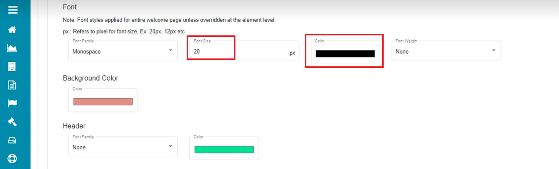
Under the Font section,
- Open the drop-down menu of the 'Font Family'.
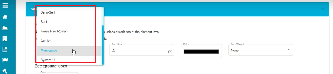
Check the box against the required font.
Click on 'Font Size'.
Choose the required Font Size for the welcome screen.
Click on the 'Color' tab.
Drag the cursor on the color palette or click on the required color to change the color.
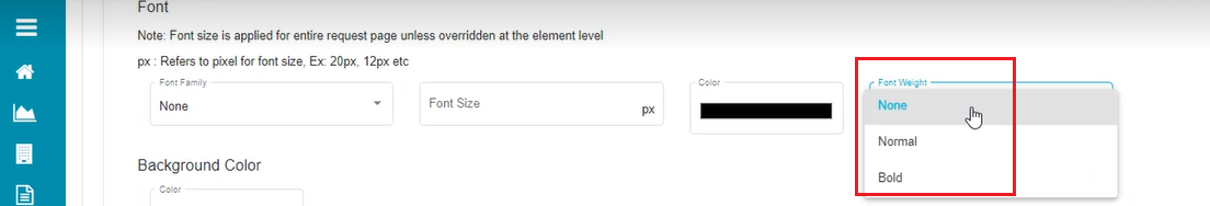
- Open the 'Font Weight' drop-down menu.
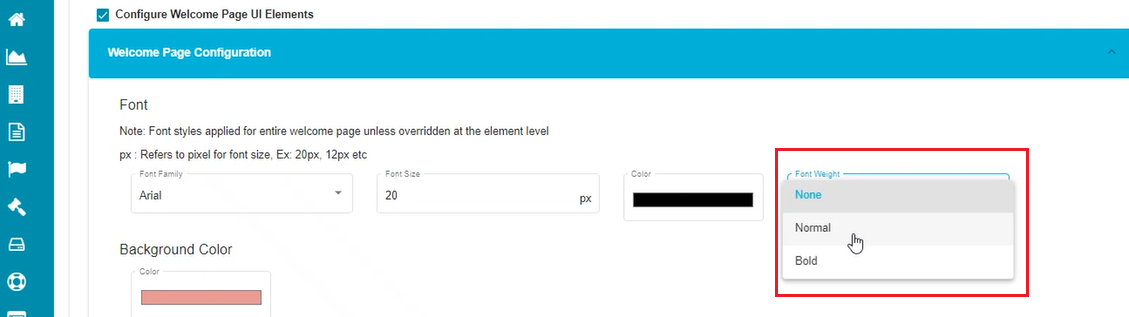
- Select the required font style, i.e., bold, normal, etc., from the menu.
Note: The changes made here are reflected in the entire text displayed on the welcome screen.
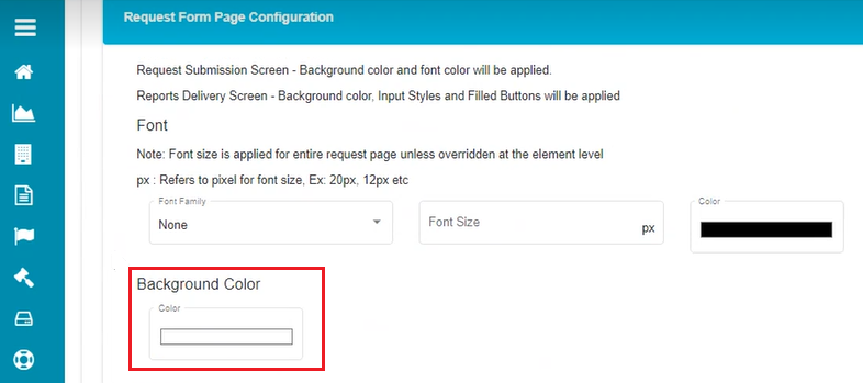
Background:
Click on the 'Background Color' tab.
Drag the cursor on the color palette to change the background color on the welcome screen.
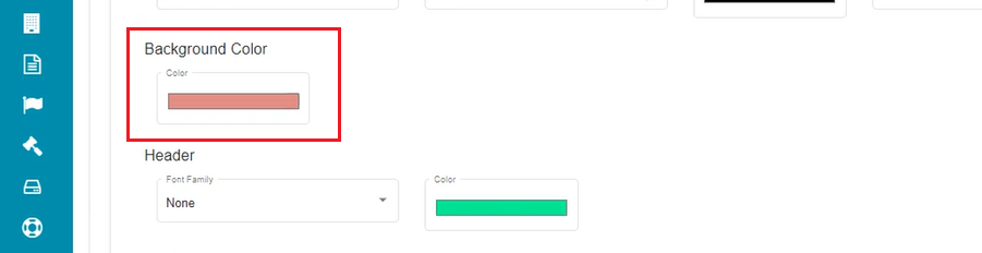
The welcome screen's background color gets changed to the selected option once the changes are updated.
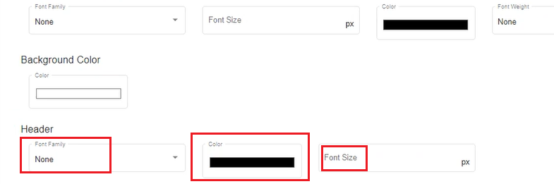
Header:
Open the drop-down menu under the 'Font Family' option of the Header tab.
Check the required font.
Drag the cursor on the color palette to change the display color of the header.
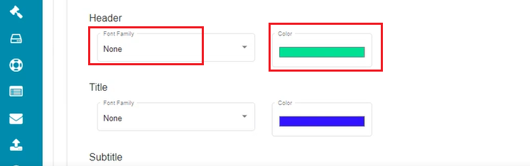
The header here is the title of the tenant's welcome screen. Any changes made here are reflected in the Welcome Screen's title.
Title:
Open the drop-down menu under the 'Font Family' option of the Title tab.
Check the required font.
Drag the cursor on the color palette to change the display color of the title.
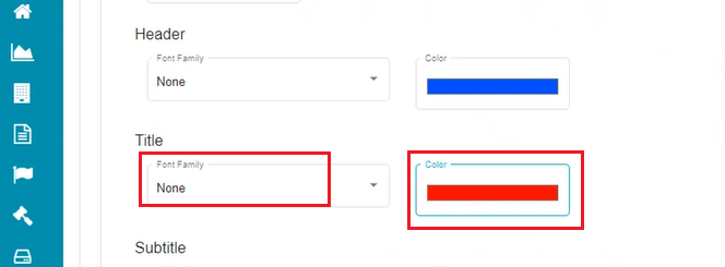
The title here refers to the sub-headings (form names and Acts) displayed on the tenant's welcome screen. Any changes made here are reflected on the Welcome Screen.
Subtitle:
- Open the drop-down menu under the 'Font Family' option of the Subtitle tab.
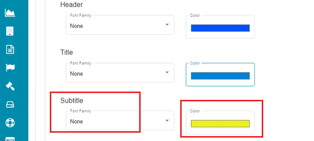
Check the required font.
Drag the cursor on the color palette to change the display color of the subtitle.
The sub-title here refers to the descriptions defined below the titles displayed on the tenant's welcome screen. Any changes made here are reflected on the Welcome Screen.
Note: Unchecking the 'Configure Welcome Page UI Elements' option and updating this change will mark all these settings to the default configuration.
For that,
Uncheck the 'Configure Welcome Page UI Elements' option.
Click on
.
For Privacy Form,
Click on
against the 'Privacy Portal Theme
Configuration' tab.Check the 'Configure Privacy Form UI Elements' box.
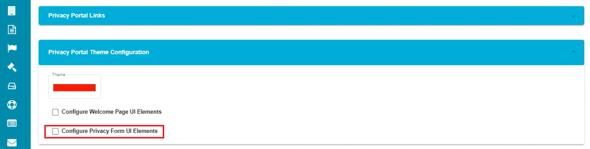
The screen displays a drop-down form for configuring the privacy form's UI elements.
- Click on against the 'Request Form Page
Configuration' tab.
Here, the screen shows different options like font, background color, title, etc. These changes are reflected in every request form associated with the selected tenant. You can configure each of these options and decide how the privacy request forms should appear to your users.
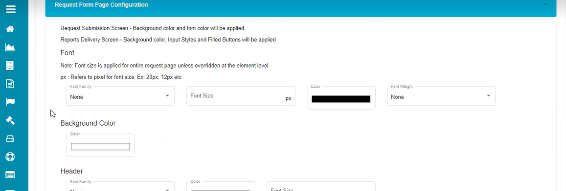
Under the Font section,
- Open the drop-down menu of the 'Font Family'.
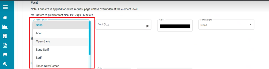
Check the box against the required font.
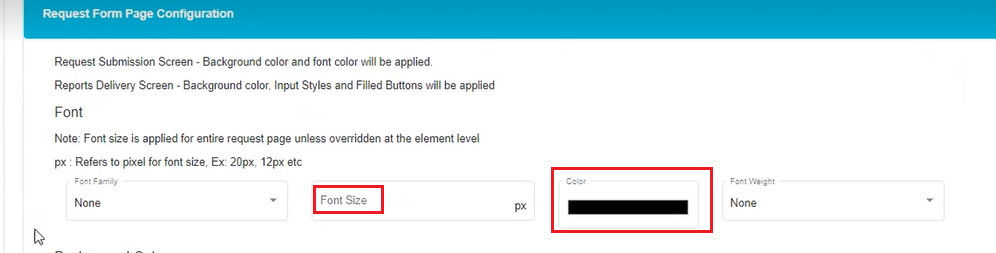
Click on 'Font Size'.
Choose the required Font Size for the privacy form.
Click on the 'Color' tab.
Drag the cursor on the color palette or click on the required color to change the color.
Open the 'Font Weight' drop-down menu.
Select the required font style, i.e., bold, normal, etc., from the menu.
Note: The changes made here are reflected in the entire text displayed on the privacy request forms.
Click on the 'Background Color' tab.
Drag the cursor on the color palette to change the background color on the request form.
The request form's background color gets changed to the selected option once the changes are updated.
Header:
Open the drop-down menu under the 'Font Family' option of the Header tab.
Check the required font.
Drag the cursor on the color palette to change the display color of the header.
The header here is the title of the request form (which is usually the request type name). Any changes made here are reflected in the request form's title.
Sub Header:
Open the drop-down menu under the 'Font Family' option of the sub-header tab.
Check the required font.
Drag the cursor on the color palette to change the display color of the sub-header.
Use the Font Size option to define the sub-header's size.
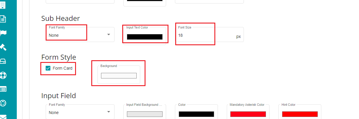
The sub-header here refers to the description appearing below the title of the request form. Any changes made here are reflected on the request form.
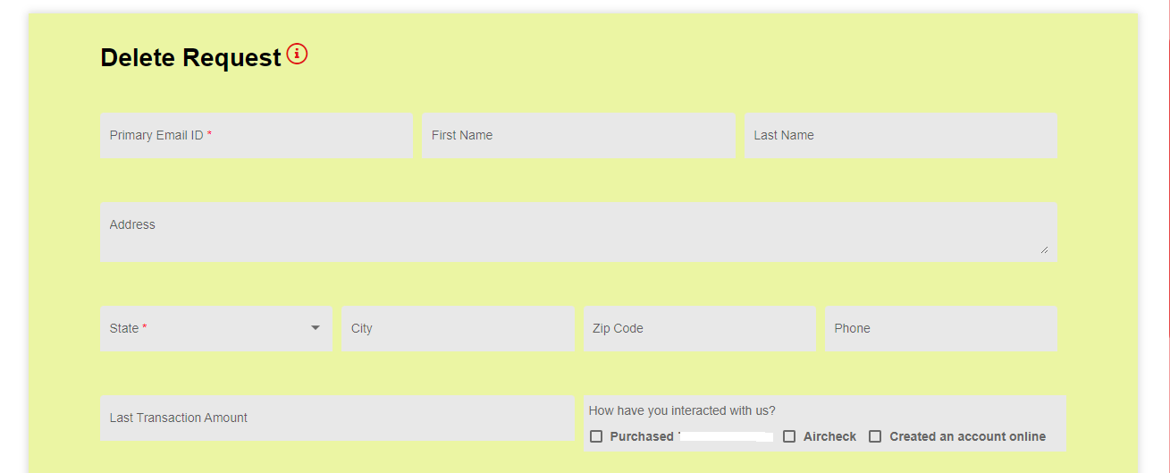
Form Style -- can be used to customize how the request form appears to the user.
Check the Form Card option if you want the request form to appear as a card.
Choose the required background for it by clicking on the Background option.

Based on this selection, the request form would appear like this:
Input Field:
The input field here refers to the different input fields defined on the request form. Any changes made here are reflected on the request form.
Open the drop-down menu under the 'Font Family' option of the Input Field tab.
Check the required font.
Click on the 'Input Field Background' palette.
Drag the cursor on the color palette to change the background color of the input field.
Change the input field's display color in a similar way using the 'Color' option.
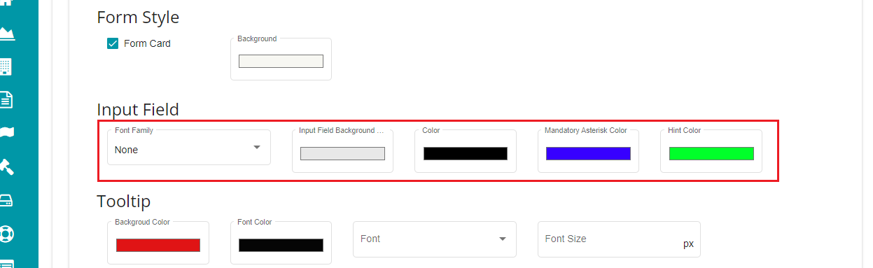
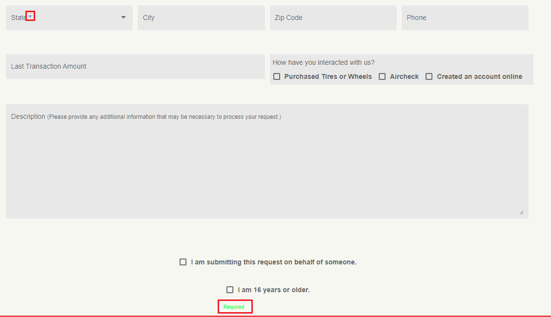
Use the Mandatory Asterisk Color option if you want to change its color on the form's input field.
The hint's color can also be changed here, through the Hint Color option.
Based on the selection, mandatory asterisk and hint colors would appear like below:
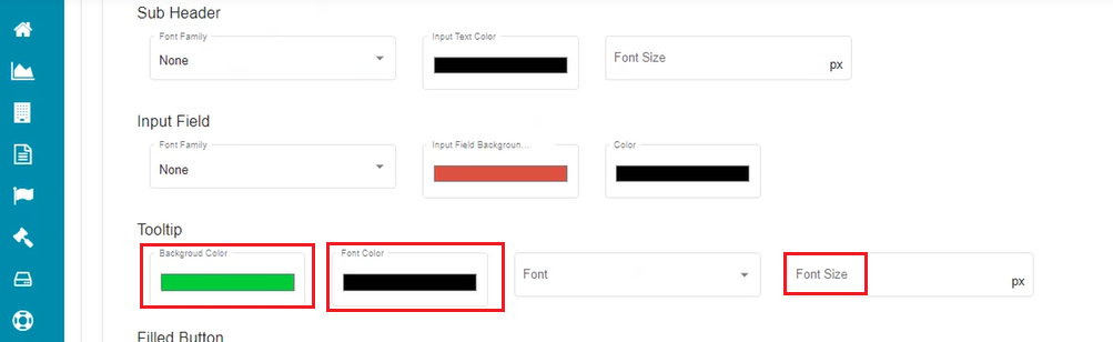
Tooltip:
Tooltip changes are possible if the chosen form has a defined tooltip. The changes are reflected on the selected form if applicable.
Click on the 'Background Color' under the Tooltip option.
Choose the required color from the palette.
Similarly, customize the 'Font Color' of the Tooltip.
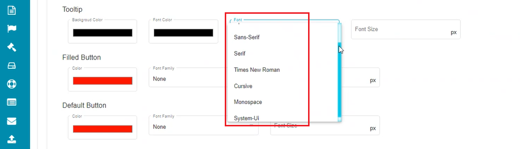
Open the 'Font' drop-down menu and select the required font.
Click on the 'Font Size' dialog box.
Choose or type the required font size for the tooltip.
Filled Button:
Click on the 'Color' under the Filled Button option.
Choose the required color from the palette.
Open the 'Font Family' drop-down menu and select the required font.
Click on the 'Font Size' dialog box.
Choose or type the required font size for the Filled button.
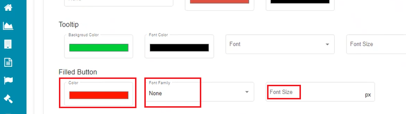
Filled Button refers to the
 button on the request form page. The
changes made here are applied to the Submit button on the request form.
button on the request form page. The
changes made here are applied to the Submit button on the request form.
Default Button:
Click on the 'Color' under the Default Button option.
Choose the required color from the palette.
Open the 'Font Family' drop-down menu and select the required font.
Click on the 'Font Size' dialog box.
Choose or type the required font size for the Default button.
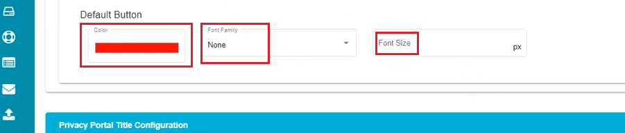
Default Button refers to the
 button the request form page. The changes
made here are applied to the Cancel button on the request form.
button the request form page. The changes
made here are applied to the Cancel button on the request form.
Note: Unchecking the 'Configure Privacy Form UI Elements' option and updating this change will mark all these settings to the default configuration. For it,
Uncheck the 'Configure Privacy Form UI Elements' option.
Click on
.
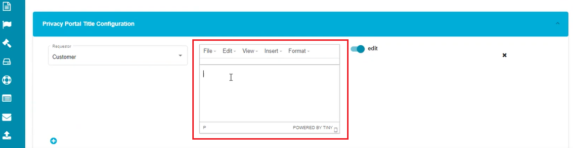
- Privacy Portal Title Configuration
The privacy portal's title (header displayed on the welcome screen) can be configured in this section. For multiple requestors, you can differentiate the title by changing the requestor type.
Click on
against the 'Privacy Portal Title
Configuration' tab.Click on
to configure the title on the tenant
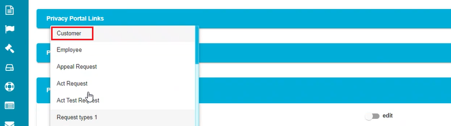
welcome screen.Open the 'Requestor' drop-down menu.
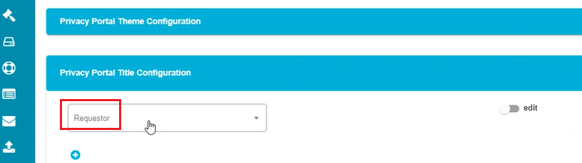
- Select the requestor type from the Requestor drop-down menu.
- Mark the
 button to make the changes.
The screen displays a tab with different options like File, Edit, etc., to customize the portal's title.
- Enter the text to be displayed as the title.
Note: Select the text before applying any changes to it.
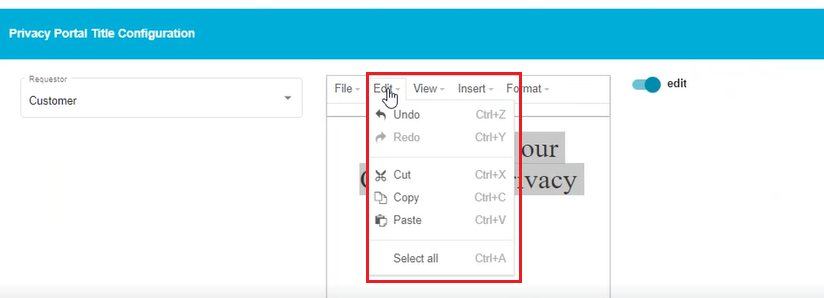
Use the 'Edit' drop-down menu for different customizations like Cut, Copy, etc.
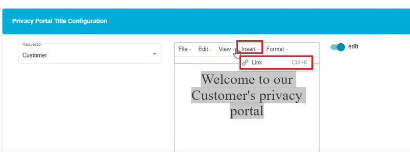
Use the 'Insert' option to include a hyperlink to the title.
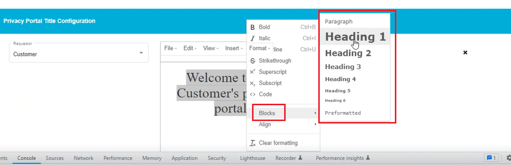
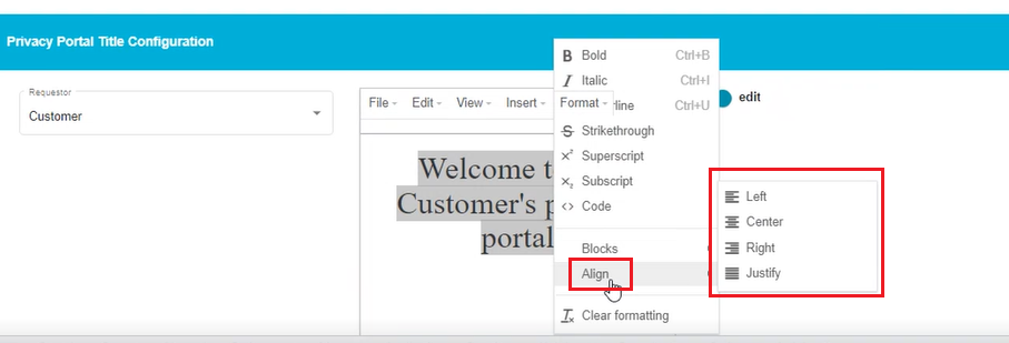
- Click on 'Format' to open the drop-down menu.
The screen shows a drop-down menu with different selections like Bold, Italic, Underlined, Blocks, Align, etc.
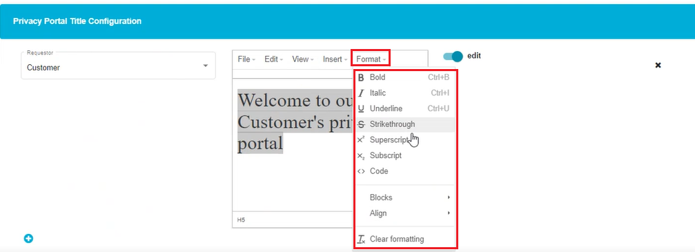
Select the required font style from Bold, Italic, and Underlined.
Use the 'Blocks' option to vary the font size and its appearance on the screen.
- Align the text in the center, towards the left or right using the 'Align' option.
Note: There is a 'Clear Formatting' option in this menu which can be used to clear the entire formatting applied to the selected text.
- Click on to save the changes.
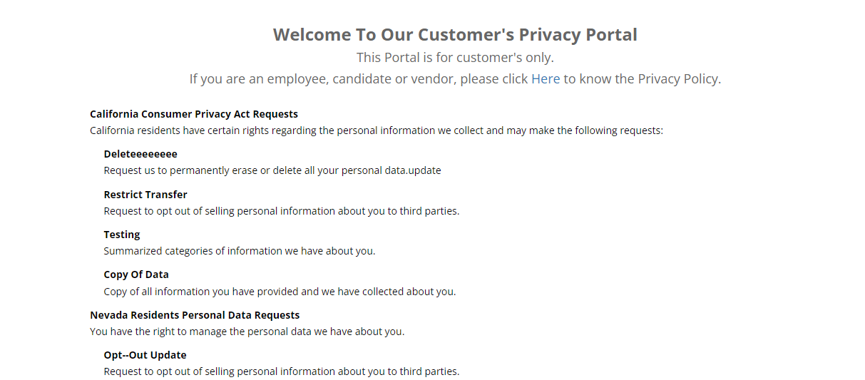
This is a sample welcome screen that you can see after configuring a tenant. The options like Restrict Transfer, Testing, Copy of Data, etc., need to be configured through the DSAR Configuration screen under the Settings menu. Refer to our DSAR user guides to configure them. Your requestors can now place privacy requests through this screen.